about
For Midweek promoters, wednesday night is the highlight of the week and that's why they decided to organise parties in the middle of it!
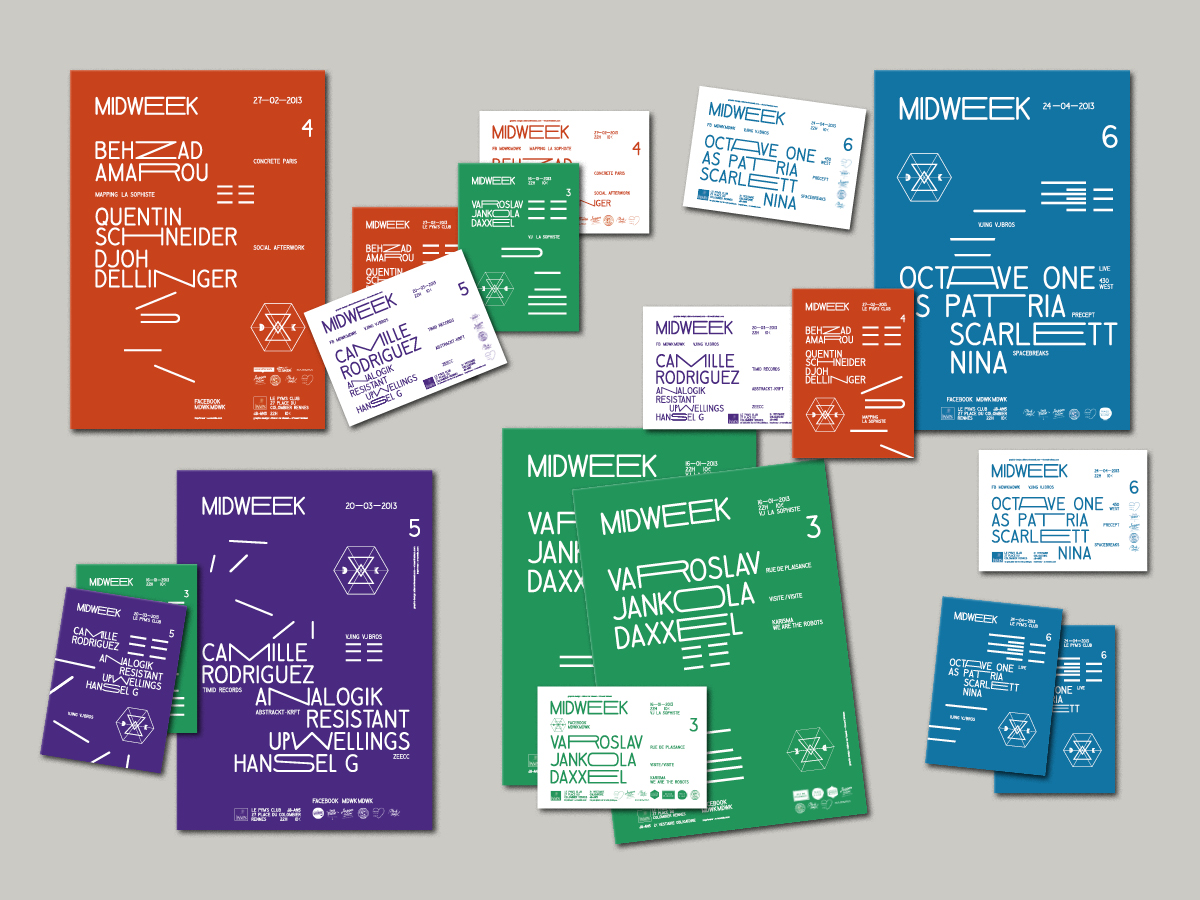
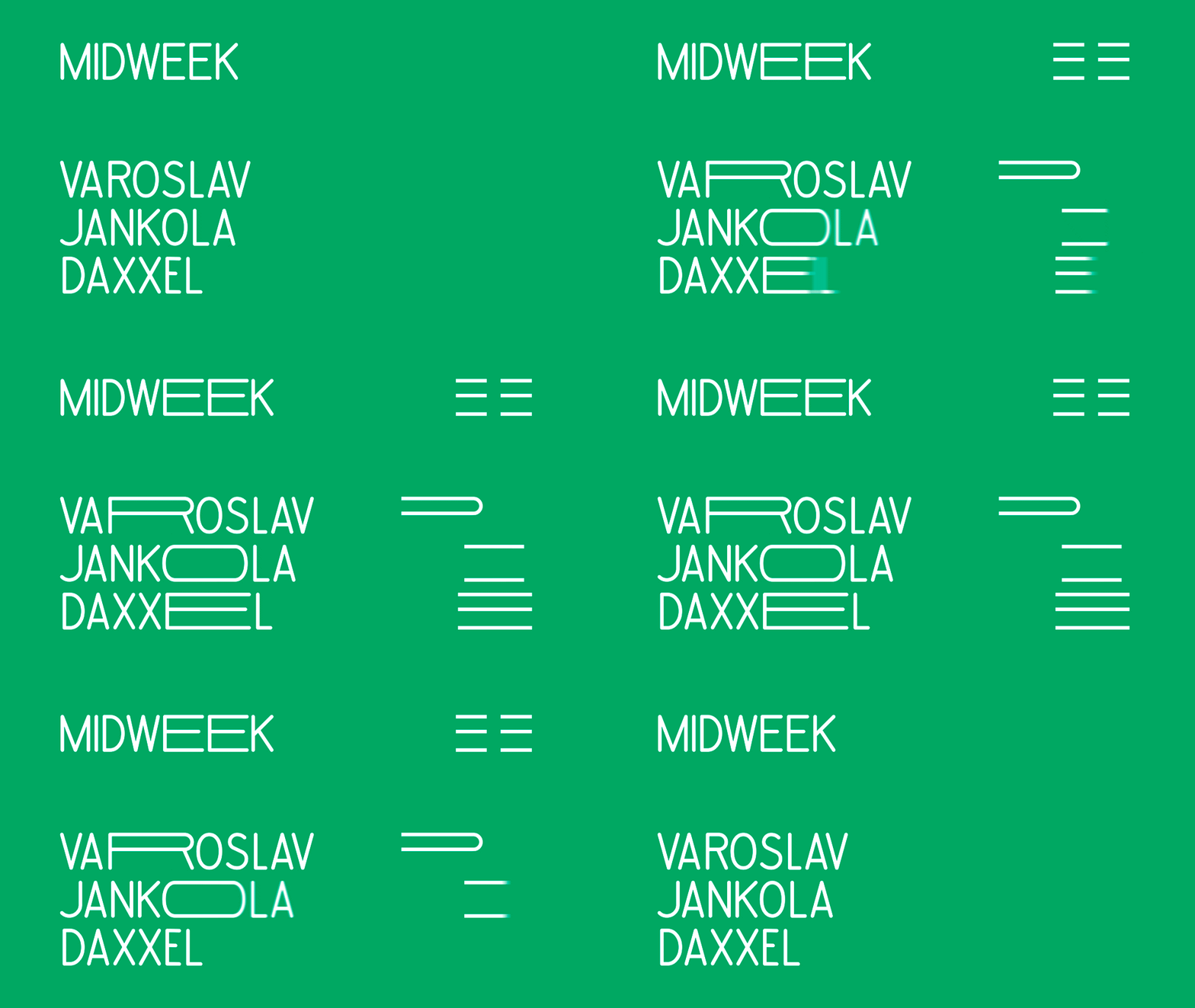
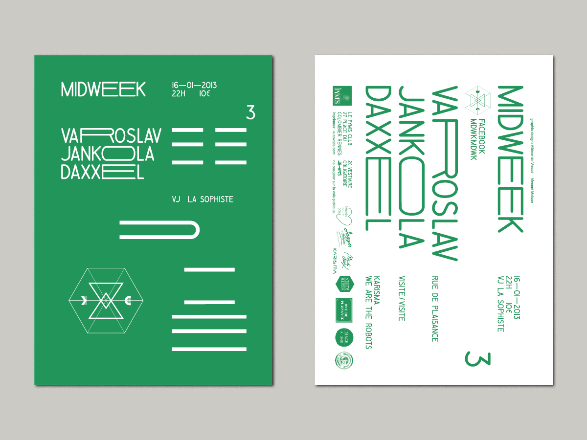
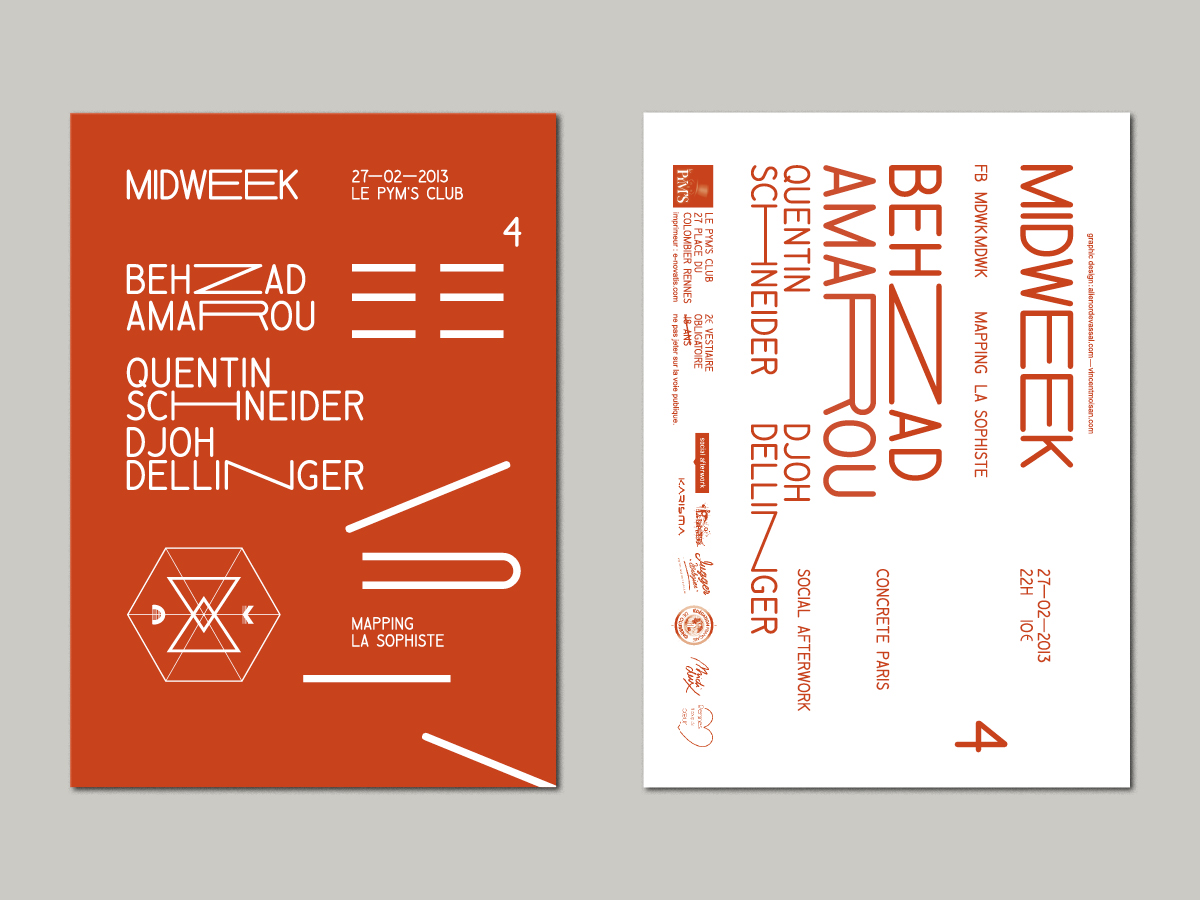
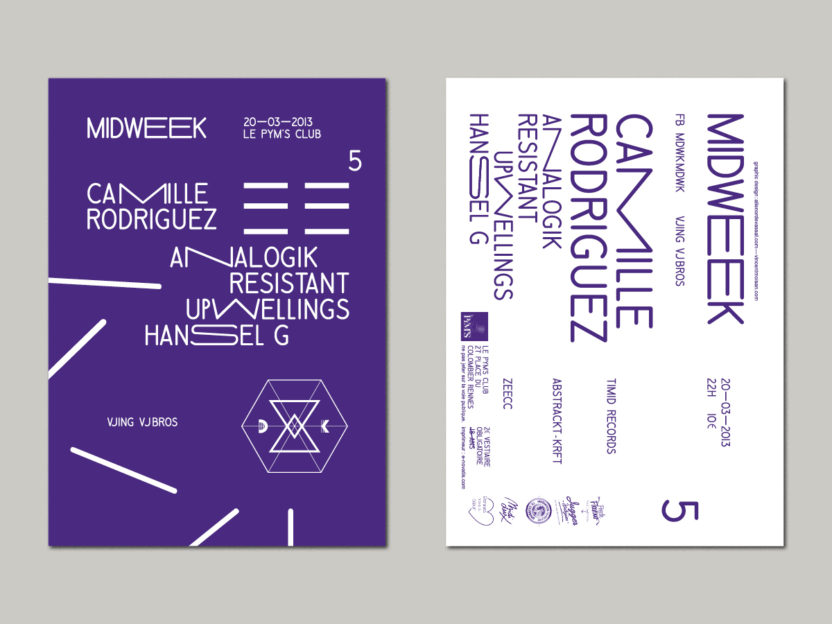
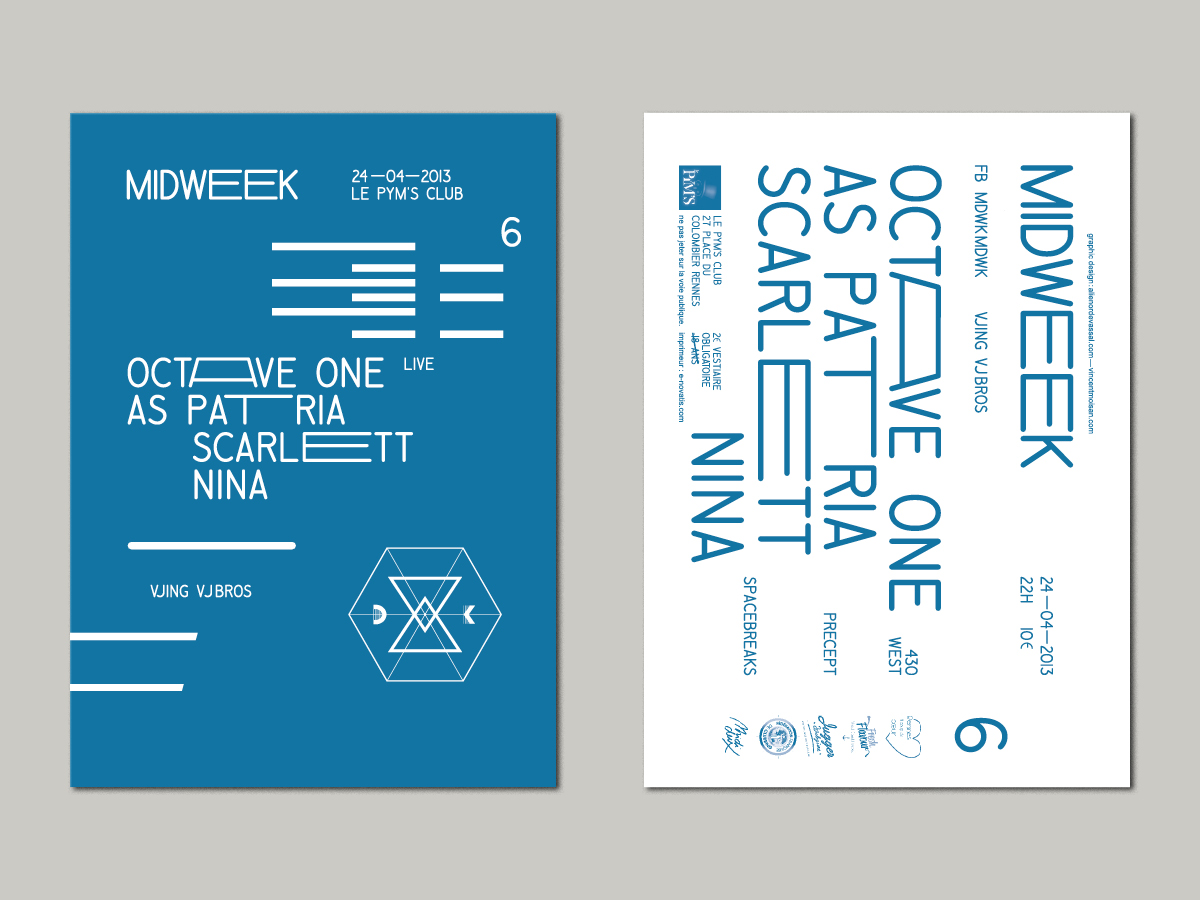
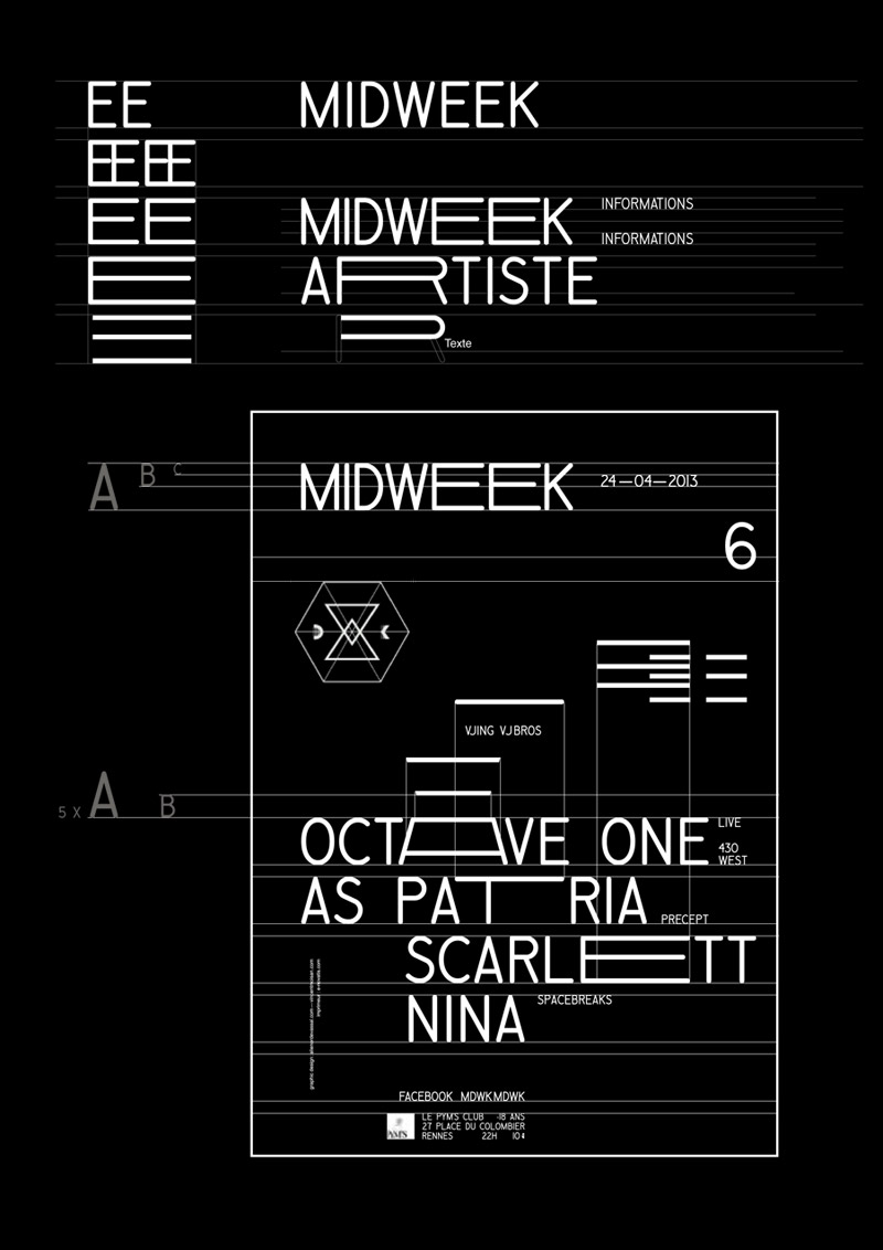
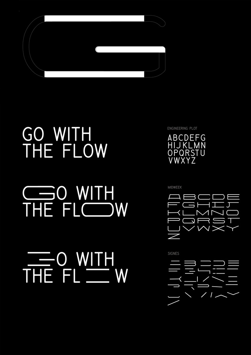
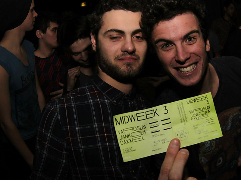
As in music, there're highlights and breaks during a week and we wanted to emphasise the idea of rhythm: we created a custom typography that enlarge the width of letters (ee) in the word 'Midweek'. Then, we applied this concept on artists' names and we extracted from this cadenced typography a graphic rhythm - unique and specific to each event - that we used as a graphic elements to design flyers and posters.
more infos
A3 Poster
A5 printed & digital flyers
Screen printed t-shirts
Tickets
Design at Alvin studio.